Visualizing Third Party Risk
A simple web-based tool to visualize supply chain risk while keeping third party risk management in mind
AITHIRD PARTY RISK
Andrew Brosman
8/17/20254 min read
Traditional third party risk management can range from requesting a SOC 2 to performing full vendor audits. However this is solely focused on the risks a vendor presents, how do we identify risks introduced by the subcontractors and subordinate vendors of our vendors (also known as 4th party)? Supply chain risk can be difficult to visualize and integrating it as part of a comprehensive third party program, even more so. Staying ahead of vendor risks is essential, but sifting through spreadsheets, reports, and scattered news can be time-consuming, inefficient, and prone to missing key details. With this in mind, I looked to AI to see how I could better understand supplier relationships.
In tackling this, my first instinct was to leverage mapping and data visualization to create an actionable dashboard of vendor risk. This seemed like a solid use case for a tool that combines geospatial insights with risk data. Sure, there are commercial platforms for supply chain monitoring, but I wanted a simple, customizable proof-of-concept that anyone could tweak and run.
So I built a vendor risk mapping tool: an interactive web app that uses user-provided ecosystem details to plot vendors on a map, assess their risks, visualize supplier relationships, and tie in security incidents and subprocessor risks for a focused view of third party risk.
The Requirements
I aimed for something that could:
Visualize vendor locations and risks on an interactive map, with easy drill-down into subprocessors and data flows.
Pull together vendor details like country, services, and risk conclusions in a searchable table.
Highlight recent security events and subprocessor risks dynamically, filtered by vendor, with links for deeper dives.
Keep it lightweight and expandable, running entirely in a browser without external dependencies.
And I focused on making it user-friendly—no overwhelming interfaces, just practical features like expandable tables and clickable elements.
How It Works
The tool is a single HTML file with embedded CSS and JavaScript, using Leaflet for mapping. Here's the breakdown:
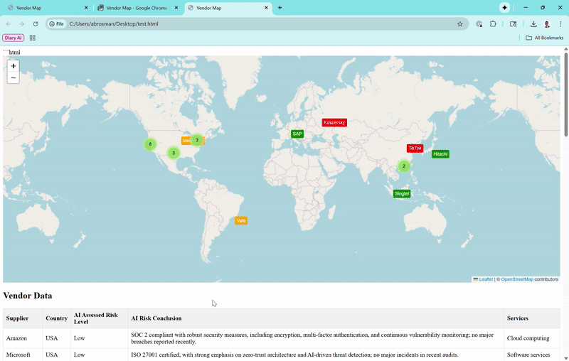
The Map View
Vendors appear as color-coded markers (green for low risk, orange for moderate, red for high). Zoom out, and they cluster loosely—only grouping tightly if they're super close, so you can see individual ones from a global perspective. Click a marker for a popup with basics, and if subprocessors exist (like Amazon's in Ireland or India), toggle to show connecting lines for data paths.Vendor Data Table
Lists suppliers, countries, risk levels, conclusions, and services. It starts with the first 10 for quick scanning, but a "Show More Vendors" button expands to reveal the full list (now over 20 real vendors, including high-risk ones like Huawei and ZTE).Risks Table
Combines recent security events (e.g., breaches or vulnerabilities) and subprocessor risks into one spot. It updates automatically when you select a vendor on the map or table, sorting by date (newest first, with "N/A" for ongoing risks). Details include links to sources for verification.Interactivity
Click a table row to zoom the map to that vendor and open its popup. The whole thing runs client-side, so it's fast and private—no server needed.
I populated it with real vendors, pulling from public data: locations via approximate HQ coordinates, risks based on compliance and news (e.g., high for Chinese firms due to espionage concerns), and incidents from recent reports. Obviously this could be fine-tuned with a provided vendor list and relevant details.
Why I Built It This Way
I kept it browser-based for simplicity—no installs, just open the file. Data's hardcoded for this proof of concept, but that means it's self-contained and easy to adjust. Risks are derived from standards like SOC 2 or GDPR, plus real events, to reflect practical concerns without overcomplicating things.
Tools and Stack
HTML/CSS for structure and styling.
JavaScript for logic, like toggling subprocessors and filtering tables.
Leaflet.js for the map, with MarkerCluster for handling groups.
No external APIs or servers—everything's local.
What Else?
There's plenty of room to grow this:
Hook in live feeds: Use APIs for real-time incidents from sources like CISA or X searches.
Add smarts: Layer in AI for risk predictions, like analyzing patterns in incidents, or for custom scoring.
More features: Search/filters on the map, export to PDF, better identification of subprocessor risk, automated notifications of new risks or changes.
Scale it: For bigger datasets, add database support or integrate directly with procurement or vendor management tools.
Maturity ideas: Deduplicate events over time, integrate with tools like Slack for alerts, or simulate "what-if" scenarios for breaches.
The Result
A quick-start tool to provide visibility into supply chain risk through an easy to understand dashboard. This allows spot checking for high-risks or subprocessor relationships which may introduce risk. It's helped me think through supply chain more visually—prioritizing risk in the context of vendor relationships and leveraging AI for real-time data.
Here's the GitHub to check it out for yourself (https://github.com/ACBrosman/supplychainrisk), just pull down the HTML file and open it in your favorite web browser. For further customization, throw the HTML file in your favorite AI tool and customize it to your environment!